Click on any screenshot to see a full-size version.
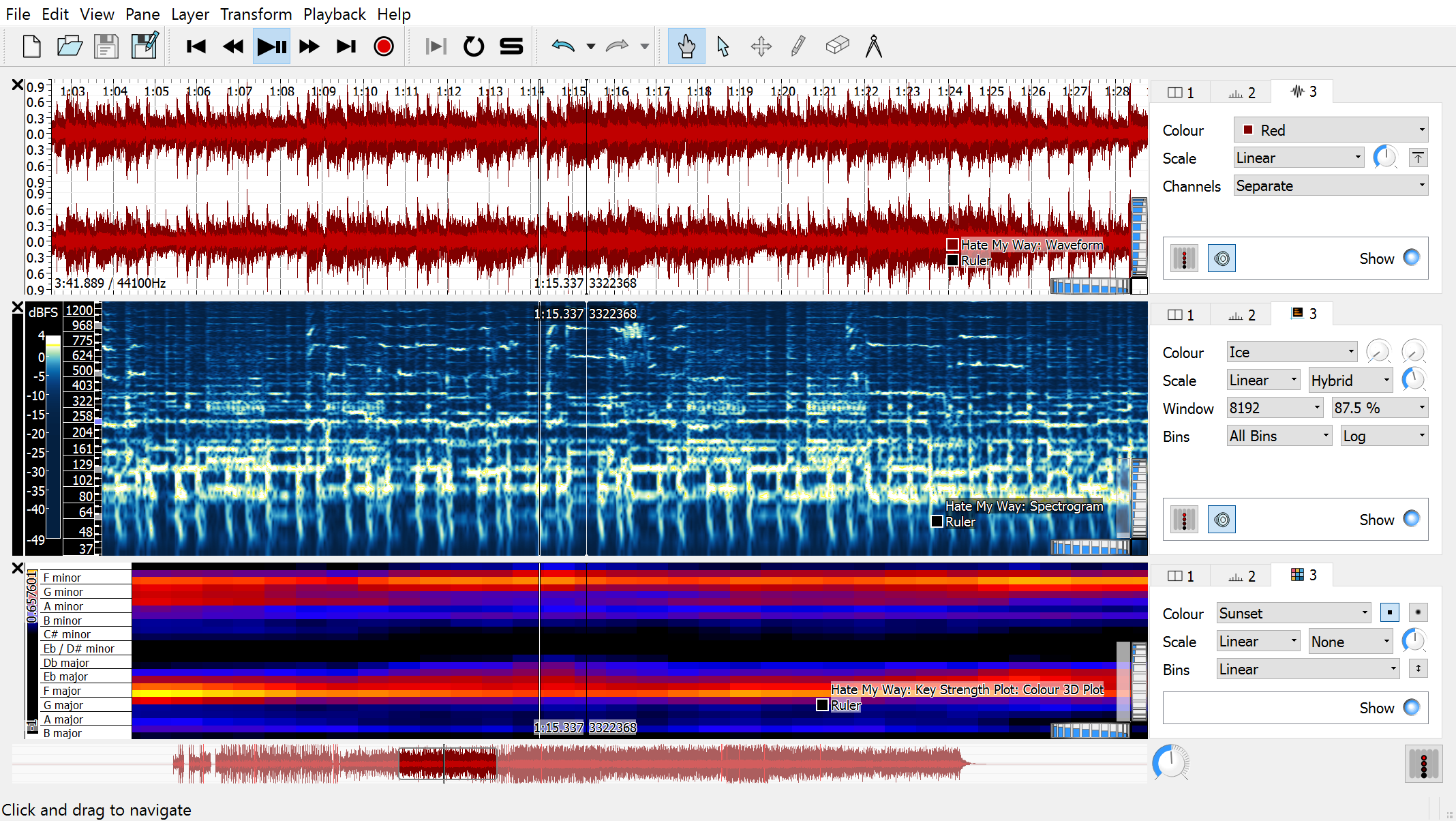
Sonic Visualiser 3.0, running on Windows, showing a waveform, a melodic range spectrogram, and a key analysis carried out by a Vamp plugin.
Sonic Visualiser 1.0 showing a waveform pane and a melodic range spectrogram pane. (The music is "After the Pain" by Carlos Pino.)
Overlaid on the spectrogram is a note layer, showing the output of a note-tracker Vamp plugin that is being evaluated. The notes from the tracker are played using a piano sample, configured in the plugin dialog visible.
Sonic Visualiser 1.0 showing about a minute of the final movement of Mahler's 9th symphony, performed by the Czech Philharmonic under Vaclav Neumann. (In fact the whole final movement is loaded and may be scrolled through – see the green overview at the bottom of the window.)
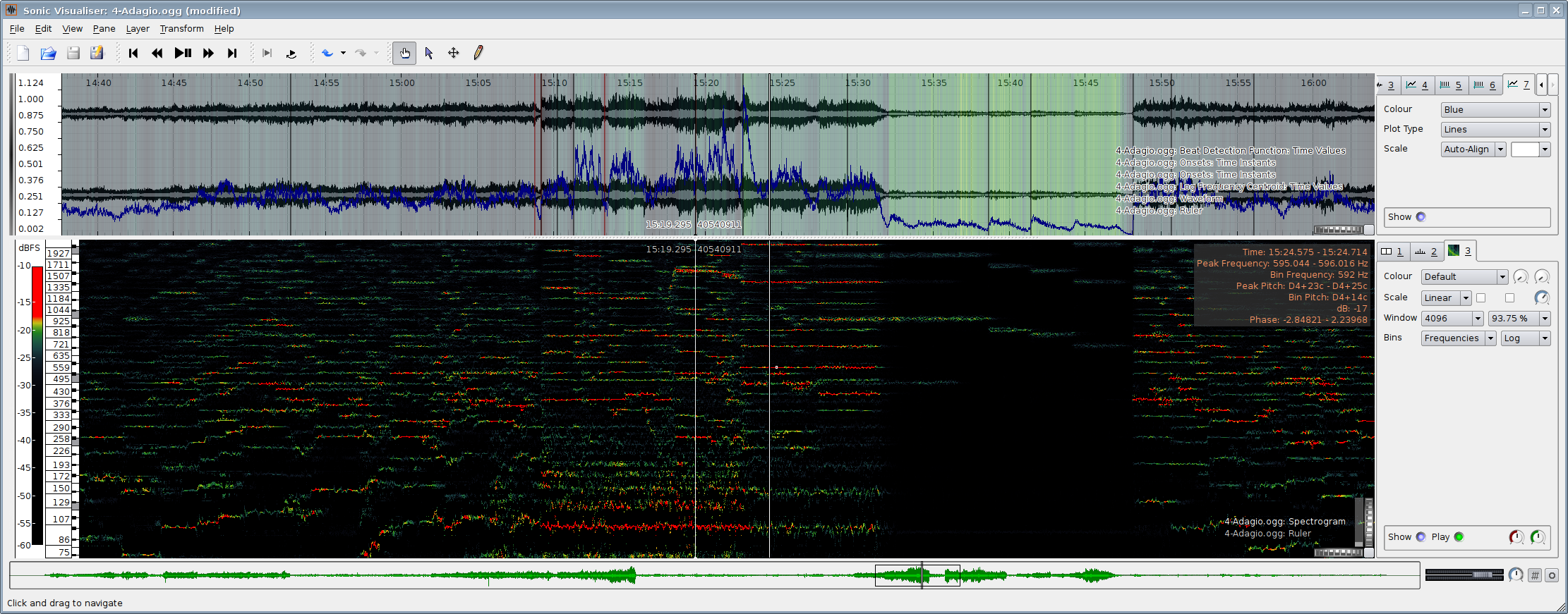
The waveform pane at the top is overlaid with a spectral centroid calculation (the coloured shading), the outputs of two note onset detection Vamp plugins (red and black vertical lines – neither of them seems to work very well on this sort of music) and the onset likelihood function from a third onset detection plugin (the blue curve). The spectrogram pane below it shows estimated instantaneous frequencies for peak FFT bins.

Sonic Visualiser 1.0 in Russian – translation thanks to the hard work of Alexandre Prokoudine. The Russian translation is included in the standard program and should be used automatically if your locale is set appropriately.
Here we see a log-frequency spectrogram and a waveform of part of Bob Dylan's "Don't Think Twice, It's All Right". (The music's in English.)

Sonic Visualiser 0.9 showing a waveform, beat locations detected by a Vamp plugin, an onset likelihood curve, a spectrogram with instantaneous frequency estimates and a "harmonic cursor" showing the relative locations of higher harmonics of a frequency, a waveform mapped to dB scale, and an amplitude measure shown using a colour shading.
The three panes in this window are at quite different zoom levels; the green overview at the bottom shows three rectangles corresponding to the regions shown in each of the three panes above. As you scroll through one pane, the other panes move accordingly (at different speeds depending on their zoom levels) to remain aligned at the centre.